Rebranding · PR agency
Refreshed visual identity and positioning for a mid-sized communications company.

Challenge
TUDOR COMMUNICATIONS, an international PR and marketing agency with offices in Brussels, Dubai, and Bucharest, had a logo and identity that no longer reflected the agency's scale and maturity. They needed a complete rebrand, from logo to applications, that would convey trust to an international client base.
Solution
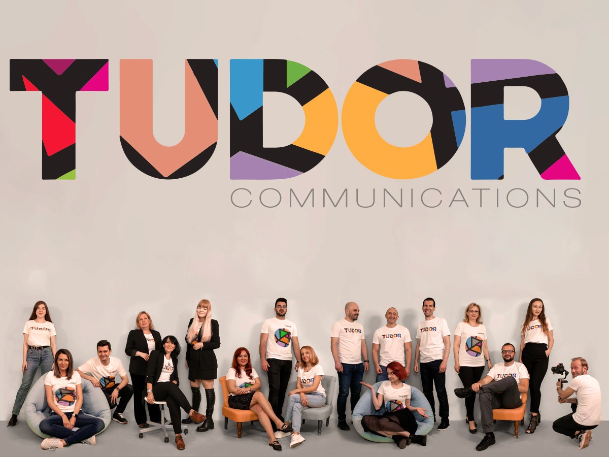
We built an identity around a unique graphic mark, a faceted, multicolored circle in which each shape represents an agency value: honesty, innovation, balance, respect, client focus, performance, passion, experience, clarity. The TUDOR logotype was completely redesigned, from a discreet mark to bold, individually colored typography, memorable and easy to apply across any medium, from business cards to promotional materials.
Result
TUDOR COMMUNICATIONS received a mature, distinctive, and memorable visual identity, aligned with its positioning as an international PR and strategic marketing agency, with a complete system of applications, from stationery to promotional materials.